Posts tagged colors
Featured on the Knot!

Featured Wedding!

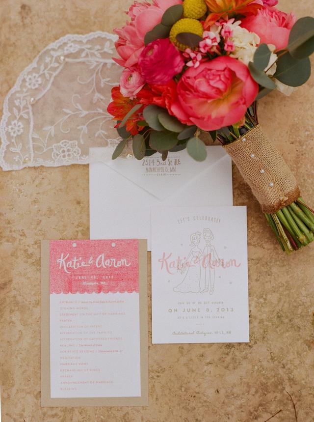
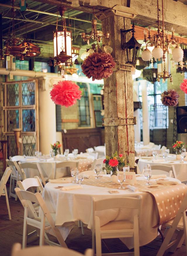
Finally got my hands on a few of the pictures from Katie and Aaron's wedding. Their wedding was featured on the Knot some time ago but I'd had a really hard time finding the pics to upload. Today I was surprised to see that the images and the original feature were magically linked to our Knot profile! Katie is an amazing illustrator and she and Aaron designed the invitation suite together. Together with Dick & Jane, we nailed down the colors, paper and final details. Everything turned out wonderfully and the pics from the ceremony/reception were just AMAZING! Have a look for yourself!

4a9ef41a-9df2-7466-f2ae-c10856352554~rs_640.h


eff7bde2-3232-dd6f-f23e-7a25475aa2b1~rs_640.h


6ebf6981-fa62-25d2-1a57-f70dcb61fc7b~rs_640.hIf you're in search of help with your custom wedding invitation design or letterpress wedding invitation printing, give us a ring!

We'd be glad to schedule an appointment at our storefront studio location or we can simply supply you with a quote!


Dry Brush and Blush

photo 2-8 We labored over what colors to run with on this for a while. Our palletes we're originally in the soft blues and sea foams combined with a deep blacks.After taking more time to look at the brides venues and inspiration we suddenly shifter gears in favor of the warmer tones. We ended with this super clean juxtaposition of a blush dry brush technique applied over a silver ink. The envelopes were also matched using a blush tone paper but for the liners, we went with a higher contrast steel grey. It was truly a labor of love. We couldn't be happier with the results!

INK!

IMG_1461

We do a lot of dark colors but occasionally we're mixing up something so delicious you just want to try a little taste. But seriously... DO NOT TASTE INK - IT'S GROSS. If you've got a magical color palette in mind, send it our way! Dick & Jane Letterpress will be more than happy to go all Lemony-Tangerine-Dream with it! Check out our blog and site for examples of our work and be sure to give is a follow on instagram as well!

@DickandJane_Letterpress

Letterpress Printing On Black Paper

Recently in the shop, it's been all about the silver ink on black paper!  After experimenting with various colors of ink, the silver wins out every time. The silver ink yields the sharpest results... hands down. Silver is considered to be the most opaque color available. Opaque white inks pale in comparison to the luminosity of silver ink.  White ink never prints purely white; it comes out more of a muddy gray than anything else.  So instead, we highly recommend using silver. Have a looky-loo for yourself.

Check out the letterpress blog for more in the near future.