Posts tagged boston letterpress
Wedding Invitation Essentials

wedding-invitation-essentials-wedding-invitation-essentials-custom-wedding-invitations-minneapolis-st-paul-boston-letterpress-chicago-letterpress-new-york-letterpress-new-jersey-letterpress-north-carolina-letterpress-nashville-letterpress-foil-wedding-invitation


A letterpress wedding invitation has to have

the Wedding Invitation Essentials.

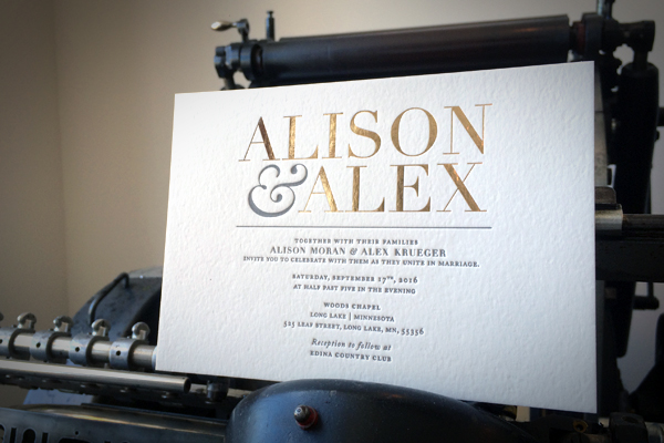
This custom wedding invitation was designed and printed a few months back and we think it has just the right blend of sugar and spice. We packed classic typography and a bold sense of style with feature and form. The real secret is in the personal flavors we added which came from really getting to know with the bride to be. The brides excitement was obvious and she was an absolute doll. We wanted to give this invitation the same sense of vibrance. We take a lot of pride in matching a couple to their invitation design and this one was no exception. Gold foil and slate grey ink on 2-ply. Oh - and who doesn't enjoy a little fun with an ampersand. Contact us for your custom quote today!

Put on Your Autumn Sweater!
fall-wedding-invitation-e1476120639666.jpg

Time for that Autumn Sweater!

Come September it's common to find invitations featuring warm reds and browns but sometimes it's more fun to push further into the concept. Seasonal invitation designs can be approached in so many more ways! Autumn Sweater- (Seasonal Wedding Invitation Design) - is very subtle but we snuck a few season-appropriate ideas into the final concept.

We often print others design work but every now and then we're given the opportunity to really let our design skills shine. This custom designed invitation was a labor of love and we had the pleasure of adding a few fancy print features to the concept as well. We included a touch of foil along with both letterpress printing and a blind impression. The pattern in the back is similar to a knit sweater texture which naturally lent itself to the diamond-shaped center area. Once we had these elements flowing it was just a matter of selecting the right fonts! The gold foil was an elegant exchange for the usual brown colors and the silver ink spoke more directly to our cozy Minnesota trees blowing in the fall breeze. The wedding was last week and it sounds like everyone was pretty pleased (as were we).

Check out more of our designs here!

Letterpress Printing and the Star Tribune?!

For a letterpress printer, there's nothing more fun than seeing a Heidelberg in the papers! So Letterpress printing and the Star Tribune?! ... well... sorta! We were visited last week by a writer and photographer from the Star Tribune. They we're researching for an article that came out last Sunday. The article was in celebration of the 1st anniversary of the light rail titled "University Avenue, Hopes are High!" The article mentioned our little shop and talked some about what the light rail has meant for us. If you haven't seen the article or are just curious about the new beginnings here on University Ave, we welcome you to visit the Star Tribune and read the article for yourself! Many thanks to the Tribune and all the supporters and small biz owners here on the Ave! - also - my friends tell me this pic makes me look old. .. boo.

IMG_2679