Posts tagged whimsical
Erin and Nick Point the Finger!

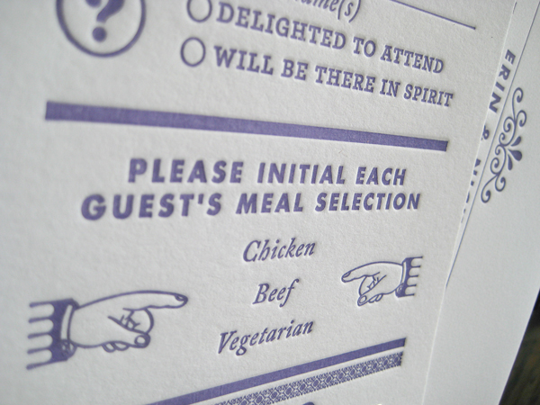
Erin came to us a few months back with a love for whimsical eclectic letterpress wedding invitations. More importantly, she required lots of pointy fingers. Her exact quote was “the more pointy fingers, the better”, and we couldn’t agree more! This invite suite incorporates seven different typestyles along with all sorts of fun quirky embellishments. Much love and appreciation to Erin and Nick for having such an amazing sense of cool. Dick and Jane Letterpress will soon be releasing an altered version to our wedding collection. xoxo - DJL

New Letterpress Wedding Invitation Design - "Baton Rouge"

Our new wedding invite showcases a whimsical, light design inspired by the “river town”, Baton Rouge. Romantic, elegant, and composed, our design is a reference to the Victorian-style architecture so well known in Baton Rouge. The script in the center of the letterpress design imitates the illustrated borders with its varying line width and calligraphic properties. Classical and soft, perfect for any wedding.

Dick and Jane Letterpress ~ Pretty Prints

Dick and Jane Letterpress is extremely proud to announce our recent feature in the Fall/Winter 2009 issue of Minnesota Bride Magazine. We were featured in a small article titled "Pretty Prints - Get a Little Whimsical With Your Invites, Embracing Bright Colors and Thematic Graphics". Featured was a letterpress wedding invitation including an Indonesian flower pattern combined with a script and red poppy motif. This particular order was created as a custom design for a Canadian client in the past season. Please note the photos below.

Be sure that you pick up your issue of the new MN Bride Magazine on local newsstands today! Visit Dick and Jane Letterpress Blog for updates on all our current adventures in letterpress printing.