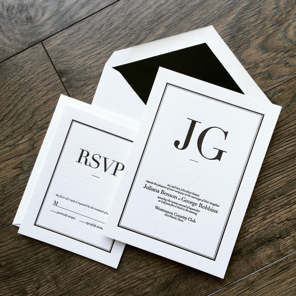
Trends will come and go but classic black on white will never get old. Never underestimate just how important your wedding invitations can be. They are the first glimpse your guests will get of what is to come and they truly set the tone. With this Benson + Robbins invitation suite, the couple simply commented, "we want a design we're going to love in 50 years time." We went typographic with the layout and ultimately I think these letterpress wedding invitations really nailed it. Grateful to work with Julie and George and we wish them the best on their wedding day!
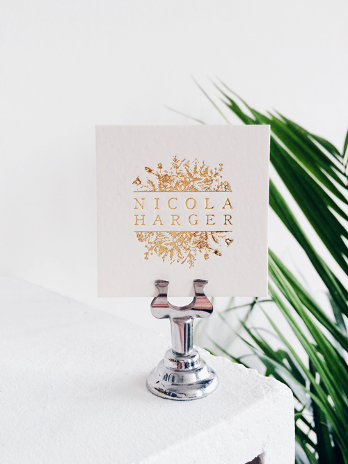 Dig on these absolutely beautiful gold foil business cards. They're trimmed at a stylish 2.5" square dimension and printed double sided on our single-ply house stock. We just finished these super cute cards for Nicola Harger. She's a photographer based in the North Loop area and her work is absolutely stunning. Check out her site and maybe if you get a chance to meet her, you'll walk away with one of these beauties?!?!
Business cards, wedding invitations and so much more! Contact Dick & Jane Letterpress for all your Hot Foil and Letterpress needs!
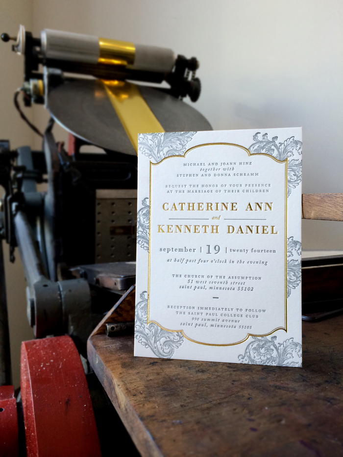 We ran these last July but today I was going through some of our archive books and found a couple left over prints. These we're absolutely one of our favorites from 2014. The interest in foil was just starting to pick up and lucky for us, Catherine and Ken we're amazing to work with. We started by looking at some examples but after talking some more about other possibilities, Catherine gave pretty free rein to "do what we do." The final result couldn't have been more stunning. Gold foil and cool grey letterpress filigree invitation. We knocked these out on the 220 Lettra and finished everything off with a gold painted edge.
Many thanks to Catherine for giving us the opportunity to really knock one out of the park.
Julie and Grant had me in type heaven! Working on this letterpress project was a lot of fun. The little bicycle illustration was the final piece that really made the set. These invites really fit their personality to a "T". 
We have a few new invite suites to release and this has definitely been a huge inspiration for one of the designs to come!
We worked with the Strawbridge Family on a number of projects for not one but two daughters weddings. This is just a quick glimpse of the letterpress wedding invite we recently designed for Elizabeth. The colors are totally amazing with a bubble gum and strawberry soda kind of combination. Not shown is that the rest f the pieces all fit together like a little puzzle as the bubbles float across everything from the bottom up. In the words of Rachel Zoe - "loves it." Thanks for visiting the letterpress blog!
We are gearing up for another exciting wedding show at the Convention center in Downtown Minneapolis. We are at booth number 657. Be sure to come by and get your $50 coupon, enter to win a FREE invitation set and see our letterpress wedding invitation work first hand! We had a blast last year. It gets so crazy in there but its a lot of fun. Music, food, beverages and all sorts of great vendors alike. If you are looking for something to do this Sunday... this is it! See you all there!
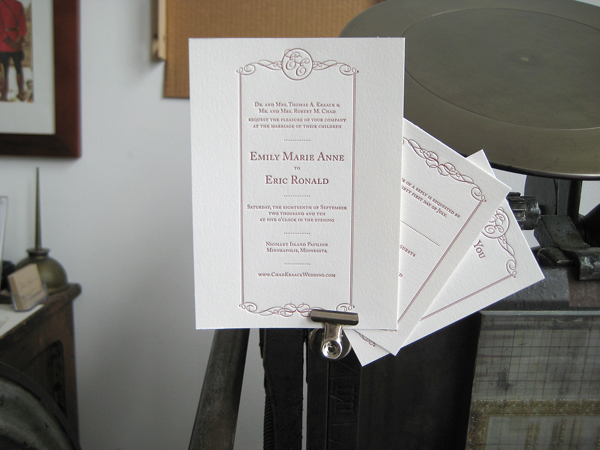
New to our letterpress blog is this classic and elegant little piece we call "Bostonian." The scroll work is clean and combined with a great white balance as well as the option to add your own monogram to the top! The letterpress invitation is bordered with a double-pinstripe line that has a subtle elegance and frames the whole invitation quite nicely. A timeless classic ideal for any wedding.
Our new wedding invite showcases a whimsical, light design inspired by the “river town”, Baton Rouge. Romantic, elegant, and composed, our design is a reference to the Victorian-style architecture so well known in Baton Rouge. The script in the center of the letterpress design imitates the illustrated borders with its varying line width and calligraphic properties. Classical and soft, perfect for any wedding.

Dick and Jane Letterpress has been good to us. Natalie and I have met some wonderful couples, business owners, and received recognition from all sorts of unexpected places. All of which we are extremely grateful. Our blog is intended to let people in to our world, share in our joys and experiences. We want people to get an inside look at what exactly goes on in a family run letterpress shop quietly located in a midwest town. That said, we wanted to announce something that is just a little out of the ordinary of the letterpress wedding invitation theme.

I (Brian) recently received an award for web design by the AIGA Boston Chapter. Coming from Boston, I work with a business partner who is based there (in Boston). Our firm is called Dirk+Weiss. We develop web sites for upscale salons and marketing companies along with the super popular iPhone aps. It's pretty much the exact opposite of a letterpress life but hey... You've got to have variety. Every two years, AIGA hosts the Bone Show (Best of New England). This year we were selected to receive the award of best web design for a project called anyonecanswiss.com. (I'll save you the description of the site) We were completely surprised by the unexpected win. Much love and appreciation to Boston, AIGA, Bone Show Judges, friends, family, and mentors. Included are images of the award and catalog.
One more video update from Dick and Jane Letterpress! This time we just finished a letterpress wedding invitation set that included a pocket folder feature. We decided to make a quick how-to video displaying exactly how these pocketfold invitations can be assembled. We're using double sided scrap book tape but there's a lot of options for adhesives. Please feel free to comment with questions or help.
enjoy!
xoxo - DJL
John and Elisabeth visited us back in early March. We had a great conversation about what they were envisioning. The couple ordered letterpress wedding invitations and announcements for the big day as well as commissioned some design work .

We put together a custom design which included 2 color printing on both pieces as well as printed envelopes. Printed on Crane Lettra "Pearl" stock with matching envelopes; Everything was finished up this morning. The colors (silver/dark-sage) turned out absolutely amazing! So much so in fact, that we decided it would be an ideal job to photograph and post up here on the blog for everyone to check out!

Thanks so much to John and Elisabeth for their business and we want to wish you both a marvelous life together!
xo - DJL


