Posts tagged wedding invitation
Tis the season for Announcements!

letterpress wedding announcements December is a busy time of year for letterpress wedding announcements and love is in the air! These custom designed save the dates came in from a designer in Alabama. Blind impression and charcoal grey ink on Crane Lettra single ply. Finished size is A7 (5"x7"). Contact us today with your wedding invitation needs. We'd be happy to supply you with a quote!

letterpress save the dates

A Classic Letterpress Invitation

Trends will come and go but classic black on white will never get old. Never underestimate just how important your wedding invitations can be. They are the first glimpse your guests will get of what is to come and they truly set the tone. With this Benson + Robbins invitation suite, the couple simply commented, "we want a design we're going to love in 50 years time." We went typographic with the layout and ultimately I think these letterpress wedding invitations really nailed it. Grateful to work with Julie and George and we wish them the best on their wedding day! letterpress_invitations

Fancy Foil!

gold-foil-invitation We ran these last July but today I was going through some of our archive books and found a couple left over prints. These we're absolutely one of our favorites from 2014. The interest in foil was just starting to pick up and lucky for us, Catherine and Ken we're amazing to work with. We started by looking at some examples but after talking some more about other possibilities, Catherine gave  pretty free rein to "do what we do." The final result couldn't have been more stunning. Gold foil and cool grey letterpress filigree invitation. We knocked these out on the 220 Lettra and finished everything off with a gold painted edge.


Many thanks to Catherine for giving us the opportunity to really knock one out of the park.

Minneapolis Skyline Invitation

minneapolis-skyline-invitation-1 minneapolis-skyline-invitation-2sno

These sat on the table begging to be photographed for months but we'd just been too busy to get a photo session in. Finally, we managed to make it happen this afternoon. True to our city, here's a really wonderful Minneapolis skyline wedding invitation set we did for T&M. We talked about a few different directions for the invitation set but once we worked up the art for the city skyline, the answer was clear and we ran with it! Blue on Blue duotone set with snow (since it was a winter wedding). If you're looking for an invitation design with some local flavor, perhaps this is just what you've been looking for?? Contact us today to get a quote on your letterpress wedding invitations!


Follow us on instagram for more of the day-to-day! @dickandjane_letterpress

Public Gardens

Public Gardens is perfectly playful and charming in every way! We think it is a perfect match for any of your upcoming spring and summer celebrations. Contact us today for more information or a personalized quote.

Banner01

Banner02

Diamond Voting!

Happy fall afternoon everyone! We just got word that we've been named a finalist in Mpls St Paul Magazine's Diamond Awards in the Outstanding Invitations category. We've been chosen by a national panel of judges but the rest is up to you! Voting opened this morning is runs through the whole month of October.

Please take a moment to place your vote! We are honored to have made it this far and would love to bring it home. You can help us by voting once a day for the next month. A big thank you to all of our customers who have made our job so totally awesome over the years!

Much love, Dick and Jane

Tickets Please!

Now Boarding all Brides and Grooms. Nickie came to us with a really cool opportunity to do a Plane ticket themed wedding invitation set! We sat down together and went back and forth over all sorts of design options. We settled with 1-color on a #10 card with all the info and a ticket stub perforation running down one side (similar to the wild tickets from a few months back). I was in a rush but I did manage to snap a few pic with the camera phone before they were picked up. Have a look. enjoy! Thanks for visiting the letterpress blog!

Erin and Nick Follow Up

Erin and Nick followed up with us last week. You may or may not remember their previous invite set? It included tons of pointy fingers, calendars, and funky text.  Any hoot... They needed an additional tidbit card to match their original wedding invitation design so we came up with this little number printed on a tiny tidbit card.

Thanks for visiting the letterpress blog!  It's been a very very busy wedding season but we are determined to keep on this blogging track. Lots of good stuff around for us to share so check back often for more updates.

A Very Wild Wedding

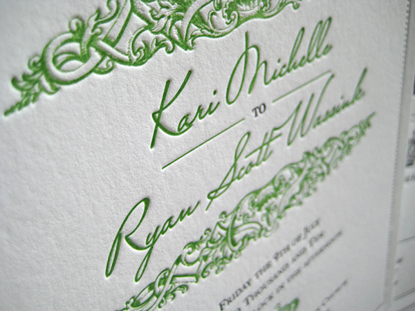
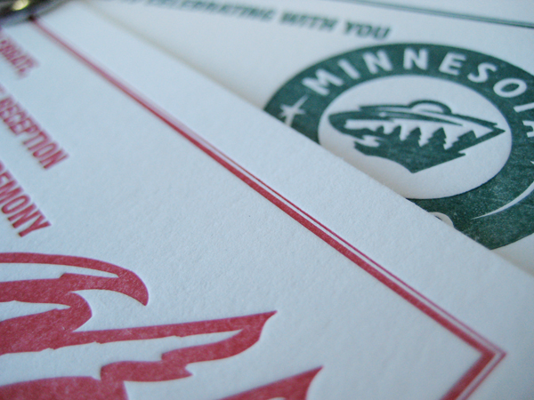
Kristen and Nicholas are super-ultimate Minnesota Wild fans.  When they approached us with the idea to turn the standard wedding invitation into something a little more edgy, the idea wheel started churning.

We thought: only a die hard fan would allow hockey tickets for their wedding invitations.  But not only were Kristen and Nicholas completely receptive to the idea--they loved it.  The gloves were off! To put it mildly, the ticket concept was uniquely them.  Few other invitations we've designed here in the letterpress shop can compare to the intensity of these. Two-color, color overlays, a little trapping and perforation along one side for that ticket stub look; These invites have all the bells and referee whistles!

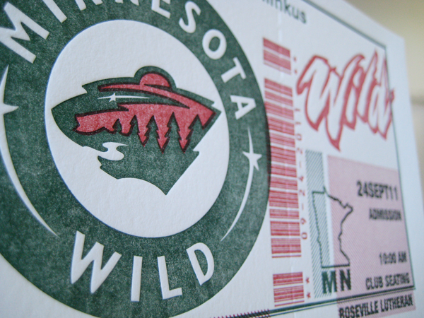
We want to thank the couple for their creativity, trust and willingness to be a little more daring than the norm.  The results of this round of printing were incredible and wouldn't have been possible without their team spirit.  The popularity of this invitation has surpassed all our expectations, wildly popular among sports fans, travel aficionados and Minnesota natives.

Visit the letterpress blog for more sweet hi-sticking invitation awesomeness!
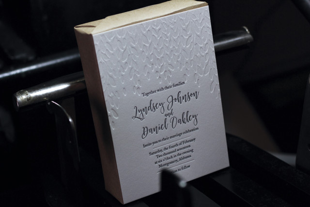
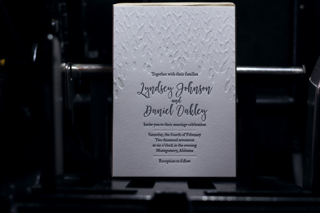
Bostonian Letterpress Wedding Invitation

New to our letterpress blog is this classic and elegant little piece we call "Bostonian." The scroll work is clean and combined with a great white balance as well as the option to add your own monogram to the top! The letterpress invitation is bordered with a double-pinstripe line that has a subtle elegance and frames the whole invitation quite nicely. A timeless classic ideal for any wedding.

Jacobsen Letterpress Invitations

Kari Jacobsen visited Dick and Jane Letterpress with lots of great ideas in need of a little interpretation. We quickly settled on this unique double border letterpress wedding invitation. Note the line and dot pinstripe and the detailed embellishments  surrounding the bride and grooms names. Elegant and simple, the design takes a simple typographic approach and pairs it with detailed illustrations (note the tiny crown). It is contemporary, eclectic, and fresh. Much appreciation to Kari for her unique vision.

New Letterpress Wedding Invitation Design - "Baton Rouge"

Our new wedding invite showcases a whimsical, light design inspired by the “river town”, Baton Rouge. Romantic, elegant, and composed, our design is a reference to the Victorian-style architecture so well known in Baton Rouge. The script in the center of the letterpress design imitates the illustrated borders with its varying line width and calligraphic properties. Classical and soft, perfect for any wedding.