Posts tagged wedding
Tickets Please!

Now Boarding all Brides and Grooms. Nickie came to us with a really cool opportunity to do a Plane ticket themed wedding invitation set! We sat down together and went back and forth over all sorts of design options. We settled with 1-color on a #10 card with all the info and a ticket stub perforation running down one side (similar to the wild tickets from a few months back). I was in a rush but I did manage to snap a few pic with the camera phone before they were picked up. Have a look. enjoy! Thanks for visiting the letterpress blog!

A Very Wild Wedding

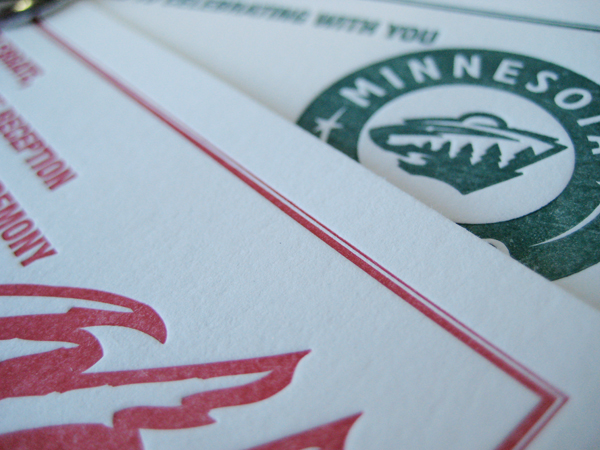
Kristen and Nicholas are super-ultimate Minnesota Wild fans.  When they approached us with the idea to turn the standard wedding invitation into something a little more edgy, the idea wheel started churning.

We thought: only a die hard fan would allow hockey tickets for their wedding invitations.  But not only were Kristen and Nicholas completely receptive to the idea--they loved it.  The gloves were off! To put it mildly, the ticket concept was uniquely them.  Few other invitations we've designed here in the letterpress shop can compare to the intensity of these. Two-color, color overlays, a little trapping and perforation along one side for that ticket stub look; These invites have all the bells and referee whistles!

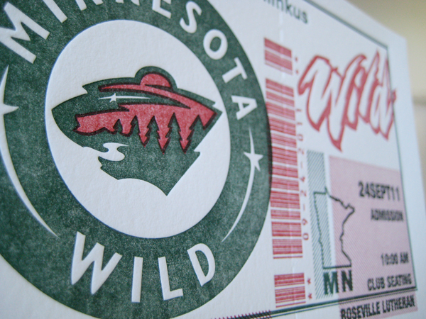
We want to thank the couple for their creativity, trust and willingness to be a little more daring than the norm.  The results of this round of printing were incredible and wouldn't have been possible without their team spirit.  The popularity of this invitation has surpassed all our expectations, wildly popular among sports fans, travel aficionados and Minnesota natives.

Visit the letterpress blog for more sweet hi-sticking invitation awesomeness!

Modern Love - MoCA Wedding Invitation

We were very excited when approached by Kelsey to create such a modern invitation suite. It's a modern kind of love! They were married at the wonderful Mass Museum of Contemporary Arts and they wanted their letterpress invitations to fit right in. We incorporated an exquisite type style and blocked type setting combined with a blind emboss of a giant coil. Why a coil you ask? Great question. Anyone who has visited the museum's event space will immediately recognize this item as the same 10ft copper coil that greets guests as they enter the through way. It was a kind of prequel for what the guests were to anticipate. We absolutely love this set and are so very proud to add it to our letterpress blog. Many thanks to Kelsey for being so inviting to creativity with this one. xoxo - DJL

TCBA Bridal Show

Was a wonderful success! We had a blast. Greeted over 1200 brides in just around 5 hours. Our heads were on a swivel and it appears that we were well received. Many thanks to TCBA for organizing the show, My wife for being so thorough with our booth branding, Dan at Speedpro for knocking out the large format stuff so quickly, and Matt VDB from Instant request for giving us all those great pre-show tips! We'll be back this January so be sure to visit us at the next wedding show!

The Wedding Fair!

Visit us this weekend at the Wedding Fair and pick up your $50 coupon good towards any order placed by December 1st 2010! We're also offering a drawing for 100 FREE Letterpress Wedding Invitations or Save-the-Dates w/ matching envelopes. Your Choice! We hope to see you there.

BEST WEDDING invites EVER

Check out bestweddingever.us. It's a wedding blog created by one of our long time friends and now client. Dick and Jane Letterpress just completed their letterpress wedding invitations which were designed by groom, Matthew White. Tiffany's Blue, and Dr. Pepper. Nothing Better. Many thanks to Matthew and Nicole for giving us the opportunity to assist in letterpress printing for their wedding day.

Bostonian Letterpress Wedding Invitation

New to our letterpress blog is this classic and elegant little piece we call "Bostonian." The scroll work is clean and combined with a great white balance as well as the option to add your own monogram to the top! The letterpress invitation is bordered with a double-pinstripe line that has a subtle elegance and frames the whole invitation quite nicely. A timeless classic ideal for any wedding.

Jacobsen Letterpress Invitations

Kari Jacobsen visited Dick and Jane Letterpress with lots of great ideas in need of a little interpretation. We quickly settled on this unique double border letterpress wedding invitation. Note the line and dot pinstripe and the detailed embellishments  surrounding the bride and grooms names. Elegant and simple, the design takes a simple typographic approach and pairs it with detailed illustrations (note the tiny crown). It is contemporary, eclectic, and fresh. Much appreciation to Kari for her unique vision.

New Letterpress Wedding Invitation Design - "Baton Rouge"

Our new wedding invite showcases a whimsical, light design inspired by the “river town”, Baton Rouge. Romantic, elegant, and composed, our design is a reference to the Victorian-style architecture so well known in Baton Rouge. The script in the center of the letterpress design imitates the illustrated borders with its varying line width and calligraphic properties. Classical and soft, perfect for any wedding.

Affordable Letterpress Printing

Dick and Jane Letterpress offers the nations most affordable letterpress printing. Our up-front, no-hassle pricing offers brides a quick and easy browsing/shopping experience. Select your favorite design, view our prices, get a quote... it's that simple! Here are a few general rules of thumb when considering all the different sizes.

1. An A7 is the most common size for Wedding Invitations. 2. An A1 is the most common size for your rsvp. 3. While an RSVP postcard is definitely super cool - it can often be more expensive than a standard A1 and envelope because a postcard usually requires printing on both sides. 4. Can you switch up sizes for something more outside the norm... ABSOLUTELY. Just be sure to consider envelope size restrictions. 5. Accompanying cards can come in any size you want. It all depends on how much info you want to fit.

Dick and Jane Letterpress wishes you all a great wedding day!

Spring Cleaning at the Letterpress Shop

Been a busy few months right from the start of the season. New interns, babies, clients, and letterpress wedding invitations. We will soon be launching quite a number of new invitation collection. In the mean time, we will try our best to get some photos posted of a lot of the items we've been working on so far this season. Be sure to check our letterpress blog regularly for all sorts of updates! xo - DJL

Spring is Coming!

Spring is coming! Inquiries are starting to ramp up as the snow melts. Dick and Jane Letterpress has been busy working through the new year and into the wedding season. We've produced a number of birth announcements and location wedding invitations. Save-the dates have also been quite popular in the last months. We've been so busy in fact that we have somewhat neglected our letterpress blog maintenance. Many apologies for that. We are getting back to the task of regularly updating things so be sure to check back often for new designs and affordable letterpress wedding invitations. xo - DJL

Letterpress Invitations - Birch Trees in the Snow

The perfect addition to the letterpress blog. These letterpress wedding invitations are one of our favorites of the year! The design and printing were commissioned by Bill and Moira for their February wedding. They had a birch and snow idea in mind. As it so happened, one of our designers had just been in the process of sketching up a birch tree design! We made a few revisions and incorporated a flurry of snow using the couples wedding colors. Custom designed by Dick and Jane Letterpress, these invitations turned out completely out of the world. Have a look!

Letterpress Wedding Invitations for the Bope/Williams Engagement

Check them out! Letterpress Wedding Invitations for the Bope/Williams Engagement. We had a wonderful time working with Nick and Carrie on these and thought they'd be perfect for the letterpress blog. They've (Nick and Carrie) got a lot of style and selected their invitation design accordingly. Super classic and wonderfully formal black ink on Pearl paper. Best of luck to Nick and Carrie as they juggle both wedding plans and Nicks' next move with medical school. XO - DJL

Letterpress Baby Announcements for Alex and Mark

Alex and Mark just had a baby. You know what that means... Announcements! Mark whipped up his own custom baby announcement design and forwarded over for us to turn out. I don't know the details of Marks design background but what can we say, he's got skillz. We always enjoy customer supplied artwork. Especially when it is so totally and completely cute. The announcements (pictured below) were printed on Crane Lettra Pearl paper with silver ink. Feast your eyes!

letterpressbirthannouncement1

letterpressbirthannouncement2

letterpressbirthannouncement3

An Oldie but a Goodie for the Letterpress Blog

We were cleaning the shop this week. While filing away some summer orders, I came across these really cool invitations! Pictured below are the final invitation, rsvp and thank you card designs for Jean Claude and Esther. They selected our Spring Leaf II wedding collection design. After a few quick tweaks, we finalized the beautiful compositions. I can't believe I overlooked adding them to our letterpress blog. I guess I'll never know how that happened? The final letterpress wedding invitations were printed on pearl paper in a sage and dark grey ink combination. Special thanks to JC and Esther for their creative attitude and proactive approach to finalizing all the little details required to make these invitations so tasty! letterpress-invitations-jce1

letterpress-invitations-jce2

letterpress-invitations-jce3

Be sure to visit our letterpress blog often for updated images and specials on affordable letterress printing from Dick and Jane Letterpress

Invitations - Invitations - Invitations!

It has been a surprisingly long wedding season for us at Dick and Jane Letterpress this year! We just finished an invitation suite as well as announcements for the Brown wedding. The couple chose our Spring Leaf II design in a burnt orange ink on the egg shell paper. All in all, we think they turned out quite nice. See for yourself. - XOXO DJLletterpress-invitations-brown1

letterpress-invitations-brown2

letterpress-invitations-brown3

Traditional Meets Extraordinary Minneapolis Wedding Invitations!

We recently finished an invitation order for the Peterson wedding. The bride and groom came in with the brides mother. The four of us sat down over a coffee and notepad where we discussed their particularly stylish taste unlike anything we had ever really attempted before.letterpress-invitations-gold1

letterpress-invitations-gold2

letterpress-invitations-gold3

The couple expressed their adoration for the traditional calligraphy/script type style however it was obvious that the two of them were a little more daring than leaving it at that. They continued to tell me about the ceremony being held at the super cool Gold Medal Flour building in Minneapolis, MN. I had recently been looking at pictures of the giant sign still mounted to the top of the roof so I was quite familiar with the allure of the building. The Petersons wanted to somehow incorporate the building into the invitation suite but do it tastefully.

After some back and forth we came up with the pictured design. We combined a blind emboss (no-ink) with an elegant script in formal black. At first glance, the invitees would not quite notice the full-bleed Gold Medal Flour sign quietly slipped in behind the script text. Also, if you lay each piece down on the table, the pieces reassemble like a puzzle to reveal one large sign which runs the width of both the invite, rsvp, and tidbit card. This was by far one of our most fun designs of the year. Thanks so much to the Petersons for being so daring. xoxo - DJL

Partying with the Knot ~ Magazine

That's right! We set the letterpress wedding invitations aside Thursday night for an evening of fun and entertainment as Dick and Jane Letterpress (along with an A-list of wedding vendors) partied with the Knot Magazine (MN). We managed to keep our heads together long enough to snap a few quick pics and even capture some small video clips. We compiled the pieces and posted to Youtube today for everyone to check out. Check out our videos posted under username: "LETTERPRESSfilms"

Special thanks to everyone at the Knot for hosting such a wonderful evening. We greatly appreciated the invitation and will be sure to stop out again in the future. Be sure to check out our letterpress blog for regular updates covering the local Minneapolis, St Paul wedding scene!

Letterpress Wedding Invitations ~ Lila & Oliver

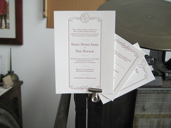
Lila and Oliver approached Dick and Jane Letterpress with a request to print their wedding invitations designs. The designs were created by Lila's sister, Livia Foldes. Truth is... It's not everyday we get the opportunity to print client designs quite as stunning as these. The designs were simple, elegant, and masterfully formal.

Lila and Natalie (co-owner of Dick and Jane Letterpress) have been friends since high school. It was quite a surprise to both Lila (now living in New York City) and Natalie (living in Saint Paul, MN) when they realized they would be working together. Much thanks and appreciation to Lila, Oliver, and Livia for the opportunity to assist in their wedding plans.

xo - DJL