We are very excited to announce that Dick and Jane Letterpress has been featured in the seasons issue of Mpls St Paul Magazine's Wedding edition in an article titled "Letter Perfect." Four separate pieces were featured in this 5 page article including a letterpress plane ticket, an oversized full-bleed Script sample titled "Hollywood". A customer submitted design for the Lucas' and a wonderfully popular Letterpress Coaster design. Here are a few photos from the article. Many thanks and appreciation to the MSPL Magazine for thinking to include us in their publication. Enjoy!

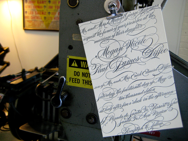
So we've had this design in the works for some time when along came Megan. She was looking for something a little more powerful than the more formal script style. We thought it was the perfect time to unveil it and it was exactly what she was shooting for. After a few small edits to really bring the design to life, we've started production. We're still getting everything printed but I just had to stop and sneak a pic to share on the blog today. The design is titled "Hollywood" and will be listed in our wedding collections soon.

Thanks for visiting the Letterpress Blog!
Our new wedding invite showcases a whimsical, light design inspired by the “river town”, Baton Rouge. Romantic, elegant, and composed, our design is a reference to the Victorian-style architecture so well known in Baton Rouge. The script in the center of the letterpress design imitates the illustrated borders with its varying line width and calligraphic properties. Classical and soft, perfect for any wedding.

We recently finished an invitation order for the Peterson wedding. The bride and groom came in with the brides mother. The four of us sat down over a coffee and notepad where we discussed their particularly stylish taste unlike anything we had ever really attempted before.


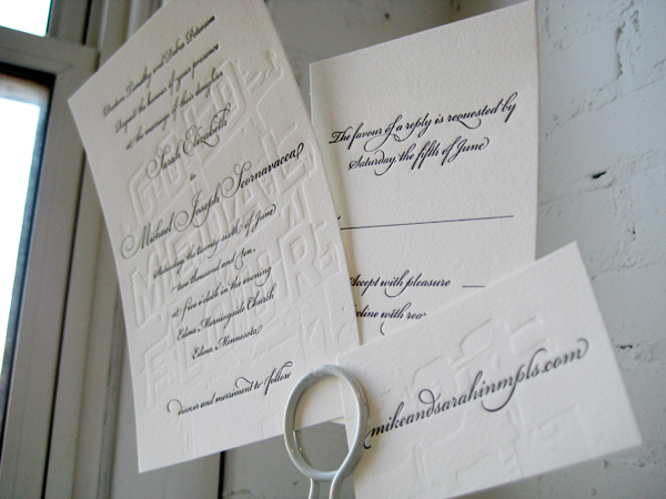
The couple expressed their adoration for the traditional calligraphy/script type style however it was obvious that the two of them were a little more daring than leaving it at that. They continued to tell me about the ceremony being held at the super cool Gold Medal Flour building in Minneapolis, MN. I had recently been looking at pictures of the giant sign still mounted to the top of the roof so I was quite familiar with the allure of the building. The Petersons wanted to somehow incorporate the building into the invitation suite but do it tastefully.
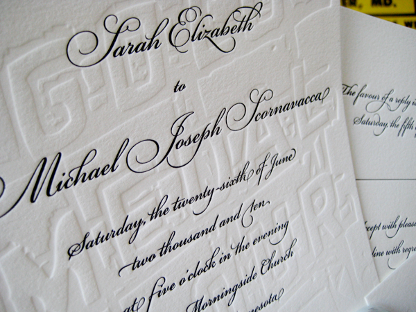
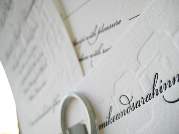
After some back and forth we came up with the pictured design. We combined a blind emboss (no-ink) with an elegant script in formal black. At first glance, the invitees would not quite notice the full-bleed Gold Medal Flour sign quietly slipped in behind the script text. Also, if you lay each piece down on the table, the pieces reassemble like a puzzle to reveal one large sign which runs the width of both the invite, rsvp, and tidbit card. This was by far one of our most fun designs of the year. Thanks so much to the Petersons for being so daring. xoxo - DJL


There's just nothing like it. Beautiful black script letterpress wedding invitations! This design was recently commissioned by Abigail Mikeworth. Abby hit the nail on the head during our first visit. "At first glance, I wasn't that into it but after looking at it a bit more, it just grew on me." There's something captivating about this invitation style. It's quite an exquisite composition to feast the eyes on. Enjoy!
xo - DJL


