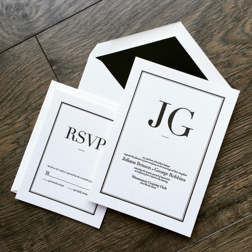
Trends will come and go but classic black on white will never get old. Never underestimate just how important your wedding invitations can be. They are the first glimpse your guests will get of what is to come and they truly set the tone. With this Benson + Robbins invitation suite, the couple simply commented, "we want a design we're going to love in 50 years time." We went typographic with the layout and ultimately I think these letterpress wedding invitations really nailed it. Grateful to work with Julie and George and we wish them the best on their wedding day!

Another one for the books! This piece was designed by the groom and she really had her mind set on black foil over black stock with the varnish. I think we were all a little nervous if this was going to work out as well as we all had hoped. However, in the end, the invitation suite really exceed everyones expectations. This is a really great example of just how much a simple black can in-fact be quite a complex beast with a lot of shade variation. We're so grateful to Stephanie for having the guts to stick to her guns and see this black-on-black concept all the way to the end!
The Minnesota Bride Magazine - Spring/Summer 2015 issue hit stands this month and it is jam-packed with all kinds of fantastic photos and articles. Even better, this issue has their annual Invitation review and guess who made it in!?

Woo-Hoo! I swear no matter how many years we've been doing invitations, every time I see our work in a printed publication, I get all kinds of super excited! Everyone around the shop is a buzz and our spring/summer clients are starting to come out of hibernation to begin working on their invitation suites. So much fun and great new designs in store for 2015.
~
If you're considering invitations and you've got a crush on letterpress, definitely hit us up! We've got all kinds of packages to fit you needs AND your budget! - xoxo DJL!
We were very excited when approached by Kelsey to create such a modern invitation suite. It's a modern kind of love! They were married at the wonderful Mass Museum of Contemporary Arts and they wanted their letterpress invitations to fit right in. We incorporated an exquisite type style and blocked type setting combined with a blind emboss of a giant coil. Why a coil you ask? Great question. Anyone who has visited the museum's event space will immediately recognize this item as the same 10ft copper coil that greets guests as they enter the through way. It was a kind of prequel for what the guests were to anticipate. We absolutely love this set and are so very proud to add it to our letterpress blog. Many thanks to Kelsey for being so inviting to creativity with this one. xoxo - DJL

Here is a set we finished this past summer which eventually found its way into a spread in this seasons issue of Minnesota Bride Magazine. We've had a lot of buzz regarding this invitation suite since then and are now in the works of producing Minnesota Wild themed tickets! They should be quite amazing too. If you're looking for some kind of plane ticket invitation, do let us know as well. There's something already in the works there too!

Don't know if any of you brides or grooms have had a chance to pick up the fall/winter 2010 issue of Minnesota Bride Magazine? Dick and Jane Letterpress is proud to announce that we have been featured on page 40 in a little article called "In Living Color". This article features "some personality with bright, bold, eye-catching invitation design." Featured is a recently commissioned Twins-themed invitation suite. Complete with barcode, Twins logo, and perforated stub as a keepsake. Go Twins and go Katherine and Gabriel Routh! ...and a special thanks to the gang at MN Bride Magazine.

We recently finished an invitation order for the Peterson wedding. The bride and groom came in with the brides mother. The four of us sat down over a coffee and notepad where we discussed their particularly stylish taste unlike anything we had ever really attempted before.


The couple expressed their adoration for the traditional calligraphy/script type style however it was obvious that the two of them were a little more daring than leaving it at that. They continued to tell me about the ceremony being held at the super cool Gold Medal Flour building in Minneapolis, MN. I had recently been looking at pictures of the giant sign still mounted to the top of the roof so I was quite familiar with the allure of the building. The Petersons wanted to somehow incorporate the building into the invitation suite but do it tastefully.
After some back and forth we came up with the pictured design. We combined a blind emboss (no-ink) with an elegant script in formal black. At first glance, the invitees would not quite notice the full-bleed Gold Medal Flour sign quietly slipped in behind the script text. Also, if you lay each piece down on the table, the pieces reassemble like a puzzle to reveal one large sign which runs the width of both the invite, rsvp, and tidbit card. This was by far one of our most fun designs of the year. Thanks so much to the Petersons for being so daring. xoxo - DJL