![]() We recently worked with Jessica Wonders (Jessica Wonders Events) on a style shoot and it turned out absolutely stunning! Even more exciting, the whole thing has been featured on the Wedding Lovely blog! You can check out all the details including the cute, tiny menus we came up with and hopefully the post and pictures will bring a little inspiration to your plans! Many thanks to Jessica for organizing the whole thing and to Wedding Lovely for sharing everyones hard work!
We recently worked with Jessica Wonders (Jessica Wonders Events) on a style shoot and it turned out absolutely stunning! Even more exciting, the whole thing has been featured on the Wedding Lovely blog! You can check out all the details including the cute, tiny menus we came up with and hopefully the post and pictures will bring a little inspiration to your plans! Many thanks to Jessica for organizing the whole thing and to Wedding Lovely for sharing everyones hard work!
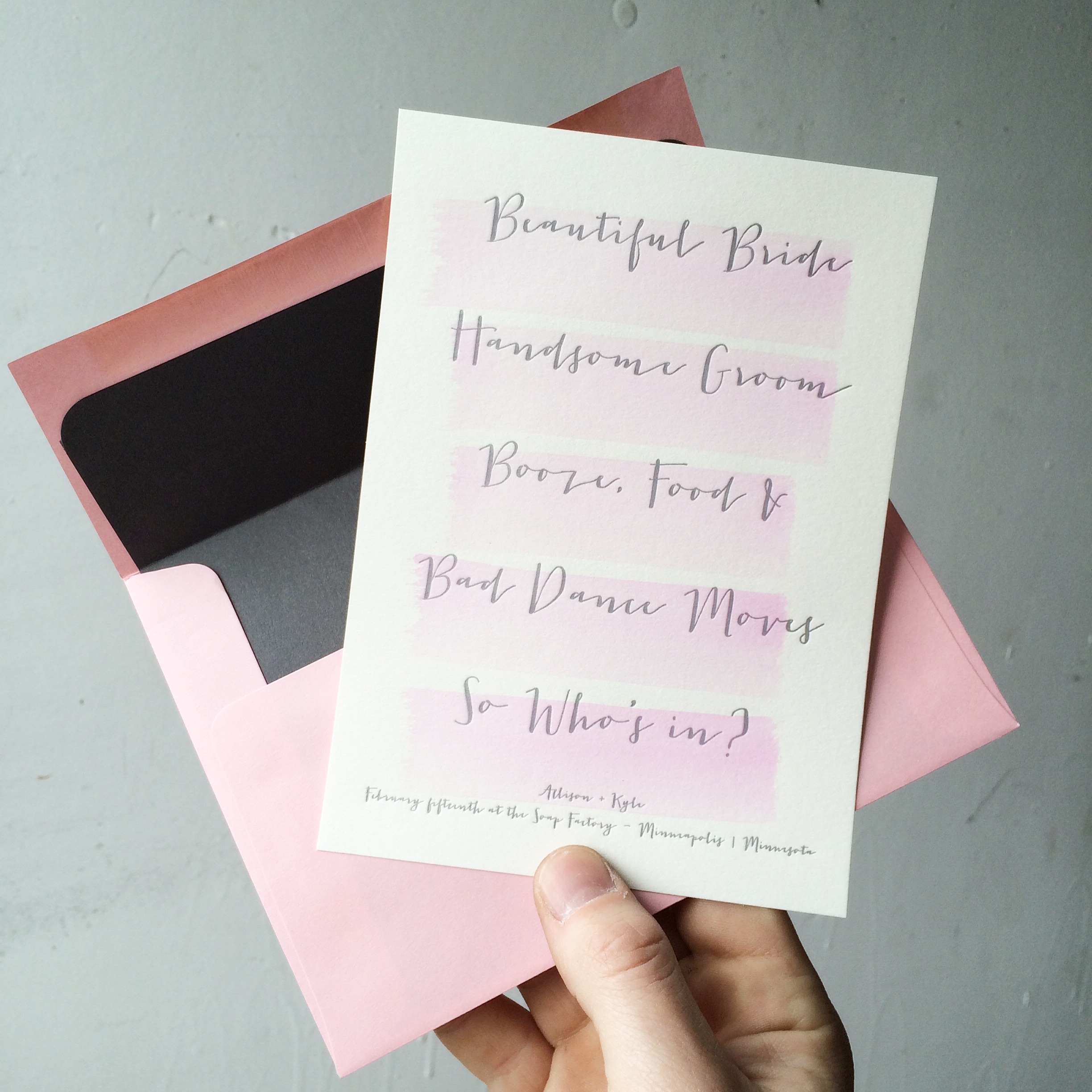 We labored over what colors to run with on this for a while. Our palletes we're originally in the soft blues and sea foams combined with a deep blacks.After taking more time to look at the brides venues and inspiration we suddenly shifter gears in favor of the warmer tones. We ended with this super clean juxtaposition of a blush dry brush technique applied over a silver ink. The envelopes were also matched using a blush tone paper but for the liners, we went with a higher contrast steel grey. It was truly a labor of love. We couldn't be happier with the results!
 Over a hundred years ago on Melcher street in Boston (also known as printers row), the pressmen would set type by hand and crank away all day. The work was tedious and tiresome. After a job was done, they'd walk out to the alley and pick a kid to come in and sort all the type back into it's appropriate drawer for the lesser half of a nickel. To my knowledge, this is where the term, "printers devil" was born.
Here I am today packing to visit kids at a local preschool for a hand-on workshop. I love watching the kids eyes light up as they print they're very first card. It's a far cry from todays iPad and iKea lifestyle but in most ways, I think that is exactly what makes these workshops so great. If you'd like to schedule an on location print demo for your school or event. Give us a ring. If we can fit it in, we would surely love the opportunity!
Whatcha got there?
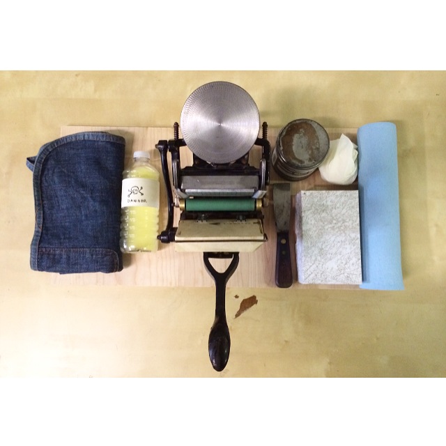
1. tiny sigwalt press
2. denim apron
3. half can of Vanson Black
4. a pair of ruber gloves
5. roll of paper towels
6. ink knife
7. small box of pre-cut biz card stock
8. tiny bottle of press wash (properly labeled with skull and crossbones)

 sno
sno
These sat on the table begging to be photographed for months but we'd just been too busy to get a photo session in. Finally, we managed to make it happen this afternoon. True to our city, here's a really wonderful Minneapolis skyline wedding invitation set we did for T&M. We talked about a few different directions for the invitation set but once we worked up the art for the city skyline, the answer was clear and we ran with it! Blue on Blue duotone set with snow (since it was a winter wedding). If you're looking for an invitation design with some local flavor, perhaps this is just what you've been looking for?? Contact us today to get a quote on your letterpress wedding invitations!
Follow us on instagram for more of the day-to-day! @dickandjane_letterpress

We have a funny schedule here. It has absolutely nothing to do with 9-5 or Monday through Friday. Our work schedule is always up in the air depending on what our customers need. I can happily say that we've never been a team to shy away from hard work on long hours but at some point, even the busiest days eventually creep to a moment of perfect stillness and accomplishment. We appreciate each and every client we've worked with over the years. If you need letterpress work, contact us.
Day or Night, we're on it. you can also follow us on instagram for the crazy 24 hour version of our work. @dickandjane_letterpress

Another one for the books! This piece was designed by the groom and she really had her mind set on black foil over black stock with the varnish. I think we were all a little nervous if this was going to work out as well as we all had hoped. However, in the end, the invitation suite really exceed everyones expectations. This is a really great example of just how much a simple black can in-fact be quite a complex beast with a lot of shade variation. We're so grateful to Stephanie for having the guts to stick to her guns and see this black-on-black concept all the way to the end!

Are you a designer or perhaps starting a small business? Already have a business card but would love to spruce it up? February is your month!
\\\\\\\\\\\\\\\\\\\\\\\\\\\\\\\\\\
We're offering 250 business cards for just $125. Submit your own design. 1-color / 1-sided Printing Printed on a hefty 140# card stock. Orders turned around in a week!
-
The Minnesota Bride Magazine - Spring/Summer 2015 issue hit stands this month and it is jam-packed with all kinds of fantastic photos and articles. Even better, this issue has their annual Invitation review and guess who made it in!?

Woo-Hoo! I swear no matter how many years we've been doing invitations, every time I see our work in a printed publication, I get all kinds of super excited! Everyone around the shop is a buzz and our spring/summer clients are starting to come out of hibernation to begin working on their invitation suites. So much fun and great new designs in store for 2015.
~
If you're considering invitations and you've got a crush on letterpress, definitely hit us up! We've got all kinds of packages to fit you needs AND your budget! - xoxo DJL!
Dick and Jane is a family business. Our lives revolve around letterpress printing and weddings. Our kids could probably say "print shop" before they could say "Elmo." I'm sure they hate being at the shop with dear old dad but if nothing else, I do get to sneak these ultra-cute pics of their utter disapproval with me! Here's Maggie still in PJ's after I had just shut down the windmill. One of these days, maybe one of the kids will have interest but until then I guess It'll have to be fussy faces.
Visit Dick & Jane / Please excuse the toys!

We do a lot of dark colors but occasionally we're mixing up something so delicious you just want to try a little taste. But seriously... DO NOT TASTE INK - IT'S GROSS. If you've got a magical color palette in mind, send it our way! Dick & Jane Letterpress will be more than happy to go all Lemony-Tangerine-Dream with it! Check out our blog and site for examples of our work and be sure to give is a follow on instagram as well!
@DickandJane_Letterpress
Maybe it's just us but around here, it's already starting to feel like spring! We've made it through the grey part of the winter and the sun is shining. We just got a picture sent from a photographer ASHLEYMICHELLE who got a fabulous shot of one of our invitation sets completed back in 2014. So much VIBE! The set features fuscia and gold foil with calligraphy, color coordinated envelopes and FANTASTIC envelope liners! I'm looking at this arrangement as a whole and it's a real marvel. Thanks so much to the client and photography studio for sending this over. - You're the best!

click image to view full size!
 We're offering a Special this September on letterpress business cards! 200 1-color cards printed on 140 lb. cover stock in a huge selection of vibrant paper colors for only $125! Submit your own artwork or one of our designers can happily give you a hand. Contact us to order your letterpress business cards today!
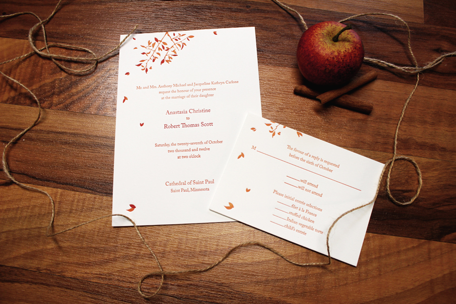
We did this fall wedding duotone set for Anastasia and Robert around this time last year. The set had been photographed and ended up being used in a few displays for wedding shows. Meanwhile, we completely overlooked adding a pic to the blog for all to enjoy. The set was based on our Spring Leaf design and produced on a natural white paper with a wonderful fall color pallet. An absolutely darling invite suite for a fantastic couple!

We at D & J drink coffee - lots and LOTS of coffee. And we got to thinking, why not give something back to our local coffee joint? As we started thinking about expanding into new materials, we did a test run of coffee koozies for our the nearby Round Table Coffee Works. Now the locally-roasted fresh brew looks as good as it tastes :) Keep a lookout for us - we might be around your favorite coffee cup, next!

Often time we wonder what happens to the pieces we produce for customers. The jobs can be so different from one to the next.
We received an email from a past client, Jordan Fretz who had us produce a set of very elaborate coasters. Turns out the final product was packaged in pairs for guests and included a pair of individually wrapped bags of tea and honey. Very cool idea indeed! Jordan did a great job on these and we just wanted to share a quick pic of the coasters for all to enjoy.
Many thanks Jordan!


Double sided letterpress printing. We get this question often. Can it be done? YES! But there are some things to be aware of. First and foremost, printing on side A will leave slight ghosted residual impression marks on side B. We can certianly dial back the impression to minimize these marks but that sort of defeats the purpose of letterpress, don't you think?? So you still want to double side your print and you want a nice, notable impression? No problem. Our best suggestions would be to either print on a duplex sheet (2 sheets glued together back to back to create a thicker sheet) or our 2-ply (double thick stock direct from the mill). Both will allow for a very nice impression with little to no damage to the reverse side. Pictured below is a job we recently finished which includes an example of double sided letterpress printing on 2-ply paper. Note the impression marks from each side are practically invisible.
*One additional advantage to the 2-ply is that if you are considering a painted edge, the extra thick stock yields great results!
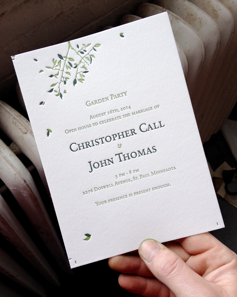 Chris and John came in a few weeks ago wanting an invitation to gather friends and family to formally celebrate their marriage. That said, they were definitely in search of a more casual feel so they came up with the idea of having a garden party! Did I mention John owns an absolutely wonderful landscaping company? Needless to say, their garden/yard is a real treat. Chris also wanted to integrate a font styling that had an architectural feel without being too fussy. We sat down over some samples, chatted about the neighborhood, and came up with this amazing duotone green on green leaf format which in its completion, really struck a chord. Many thanks to Chris and John! - pictured here pre-final trim.
 This is another customer submitted design which became a favorite of the season around the shop. The layout clearly observes the typical rules of invitations with things like hierarchy, balance, weight and a gentle hand. On the other hand, the groom and brides names are completely different fonts, there are at least 4 + different fonts being used and the card was cut to a custom size for specialty envelopes. I won't say what company the designer works for by day but I will say her work combines fashion and the outdoors on the daily. Being this was a Wisconsin wedding, It's clear this is a case of the bride and designer being a fantastic match! - reflex blue on fluorescent white single ply.


Gold foil, blush, reds, great and sea foam appear to be the trend for us this year. We've done more gold foil this season than any past year and we couldn't be more excited to show off the work! Our last post included the quilted pattern while this piece shows off both letterpress and gold foil on 2-ply as well as a stunning, vibrant red painted edge! This design was customer submitted and what an absolute treat it was. So many thanks to Hollis for the opportunity to produce such an amazing invitation suite. Many thanks and love! xoxo - DJL
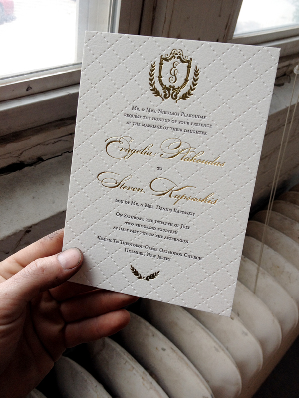
We had the opportunity to create this wonderfully beautiful quilted letterpress wedding invitation a few weeks ago. We started by pressing the quilted texture into the 2-ply sheets with no ink. Then we followed up with a dark grey ink and gold foil on top to really drive it home. It's almost hard to capture in photographs how refined these are. My dirty fingers aren't helping either I suppose! Contact us today for your more info on letterpress or custom foil invitations!
Many thanks to Steve and Ang - xoxo - DJL!